Simmetrie: Giovanni Cappelletti and Artemide
Simmetrie, a series of interviews in balance between design and architecture.
An interview with the Milanese architect Giovanni Cappelletti, confronting the remarkable brand Artemide, world leader in high-end residential and professional lighting. Founded in 1960 by Ernesto Gismondi and Sergio Mazza, Artemide has received numerous national and international awards, making it one of the emblematic companies in the design lamp sector.
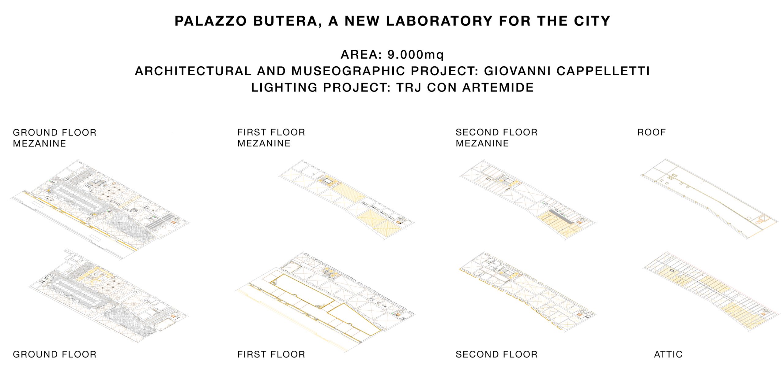
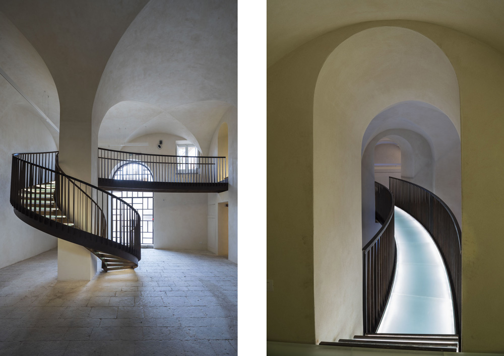
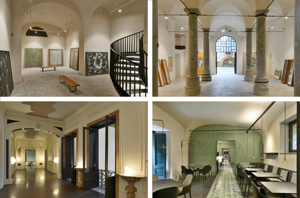
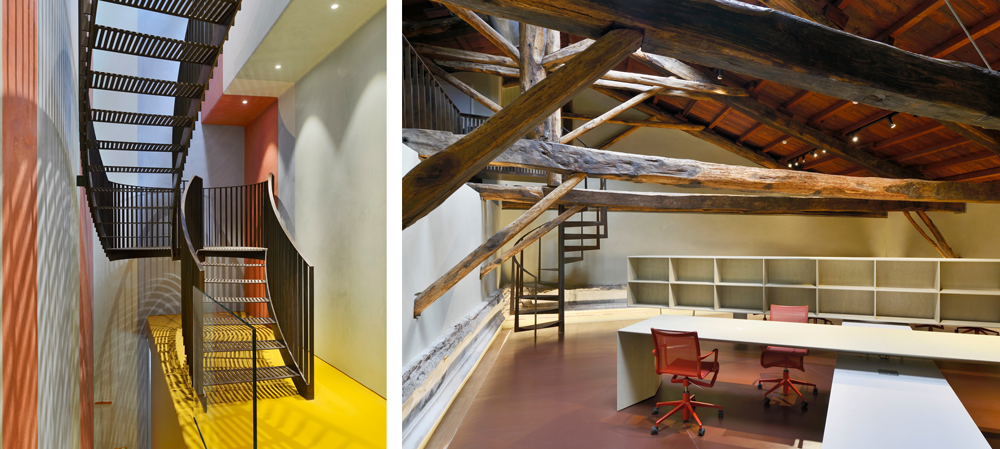
One of the most important and gratifying collaborations for TRJ is the ongoing one with the architect Giovanni Cappelletti and with Artemide, on the project for the conservative restoration and extension of Palazzo Butera, the majestic eighteenth-century building located in the Kalsa district in the historical centre of Palermo.
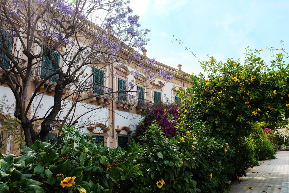
It is precisely in order to satisfy the design and lighting requirements that TRJ‘s design consultancy services and the supply of Artemide lighting systems are provided.
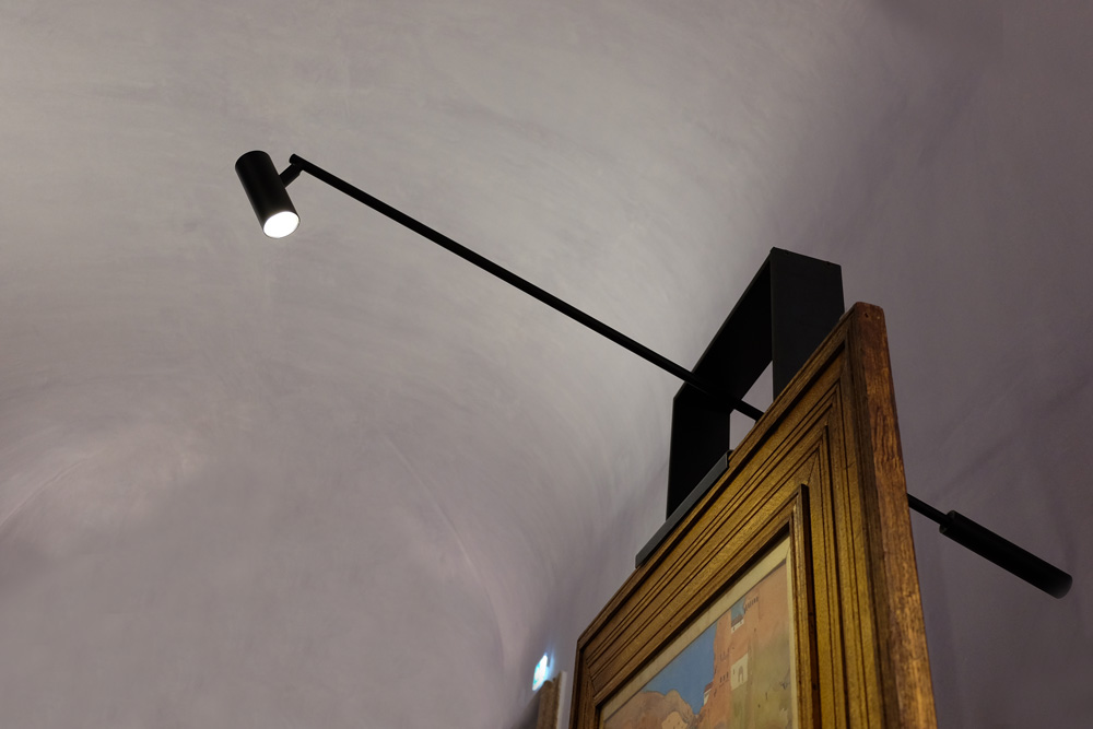
The restoration project and the museographic one necessitated different types of lighting, according to the different exhibition requirements, the spaces and materials, sometimes with a more traditional approach, others by using a more innovative one. Many times these needs have been met with products from the extensive Artemide catalogue, other times with products made ad hoc by the company itself.
It is in this symmetrical relationship, based on balance and respect between the parties, that a great project is born, a unique collaboration which has led to the opportunity to hear the voice of the protagonists.
“Before answering the questions, I would like to slightly shift their meaning through a semantic clarification – the architect Giovanni Cappelletti tells us – Personally I do not particularly like the word Symmetry, which expresses a concept that I have always found rather rigid and easy to apply. Symmetry is easy; symmetry is predictable; symmetry is sometimes trivial and leads to a “beauty” that I find a bit too “linear”. I much prefer the word Eurythmy to the word Symmetry!”
Eurythmy, noun [from Latin. eurythmĭa, derived from the Greek εὐριθμία, composed by εὖ «well» and ῥυθμός «rhythm»]: harmonic and proportional arrangement of the various parts of a work of art, especially in architecture.
“Eurythmy expresses an articulated order between the parts, endowed with complex internal correspondences; it describes a beauty that cannot be caught at a glance but which requires attention; a dynamic and harmonious proportion; a composition in which each element is arranged in a balanced order – but which can also be interpreted as a lively, exciting order! –However, if applied to a different context, it expresses the tendency towards a kind and attentive, or rather eurythmic, relationship between people and objects”
1. What is your relationship with the “objects” and in particular with those of Artemide?
As far as I’m concerned, I would say that there is certainly a relationship of eurythmy, of dynamic and harmonic correspondence with certain objects.
They are what Le Corbusier defined as “Poetic Reaction Objects”. According to Le Corbusier, these were natural objects (such as stones, wood, shells, fragments of bark). But they can also be those simple objects “with no design” that are found everywhere in the markets or, conversely, they can be famous “pieces” created by the Masters of the design world (one name above all: Franco Albini).
Within the Artemide production (but also in that of Danese Milano) there are certainly objects that are strongly evocative to me: The Lesbo lamp by Mangiarotti, a true luminous sculpture; Sottsass’s Callimaco, which is in itself a successful exercise in eurythmy as a harmonic composition of formally autonomous pieces; Sapper’s Tizio, which has been for me an object of desire since my university days.
Among the more recent works, I would like to mention Unterlinden by Herzog & de Meuron and Demetra by Fukasawa. A separate place is reserved for the IN-EI series by Miyake together with the lamps by Munari for Danese Falkland and Bali: for me, all these are true “objects with a poetic reaction”.
2. In your projects do you let architecture dominate interior design, the opposite or are you more looking for a relationship of balance?
I don’t see a substantial difference between architecture and interior design. I understand these two definitions above all as a “leap of scale”, that is, an in-depth study on a different scale of the same problem: that of living. This term must be interpreted in the broadest possible sense.
So not only the House, but also all the spaces that allow human activities to occur: from work to cultural activities and entertainment.
This means that the means I use to define the living space derive indifferently from the two areas of the project you referred to in the question.
3. Which of your projects do you consider more symmetrical (or asymmetrical) in this sense?
I must start by saying that most of my work has taken place in the field of Exhibition Design where, over time, I have created about thirty exhibitions and at least three museums.
A first consideration: the very nature of these works leads us to think in a eurythmic (and not symmetrical) way. Ultimately, what is an exhibition or a museum if not the harmonious composition of works, each endowed with has a strong individuality?
Each of these works must find its own “right place” within the space set up by the project, through which it may relate to the whole.
In this search for the ideal space for the work to be exhibited, the design of light plays a fundamental role: it is only through a careful use of lighting applied to the museographic project and the space, that it is possible to make the pieces exhibited coexist in a virtuous relationship, so that visitors can enjoy them at their best. Thanks to a joint study between myself, Artemide and TRJ, special lighting appliances, for the historical halls of Palazzo Butera and for the easels displaying works of art, were created according to my design.
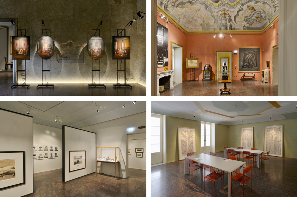
The eurythmic relationship between the objects on display is therefore for me built not only by the museographic project, but also by the use of light which is an integral part of that project. And using high-performance products such as those by Artemide certainly facilitates the achievement of an optimal result.
4. Which of the objects created by Artemide do you feel most emotionally attached to?
Lesbo by Angelo Mangiarotti, Callimaco by Ettore Sottsass, Tizio by Richard Sapper, Unterlinden by Herzog & de Meuron, Demetra by Naoto Fukasawa and IN-EI collection by Issey Miyake.
ph. Michele Nastasi
